
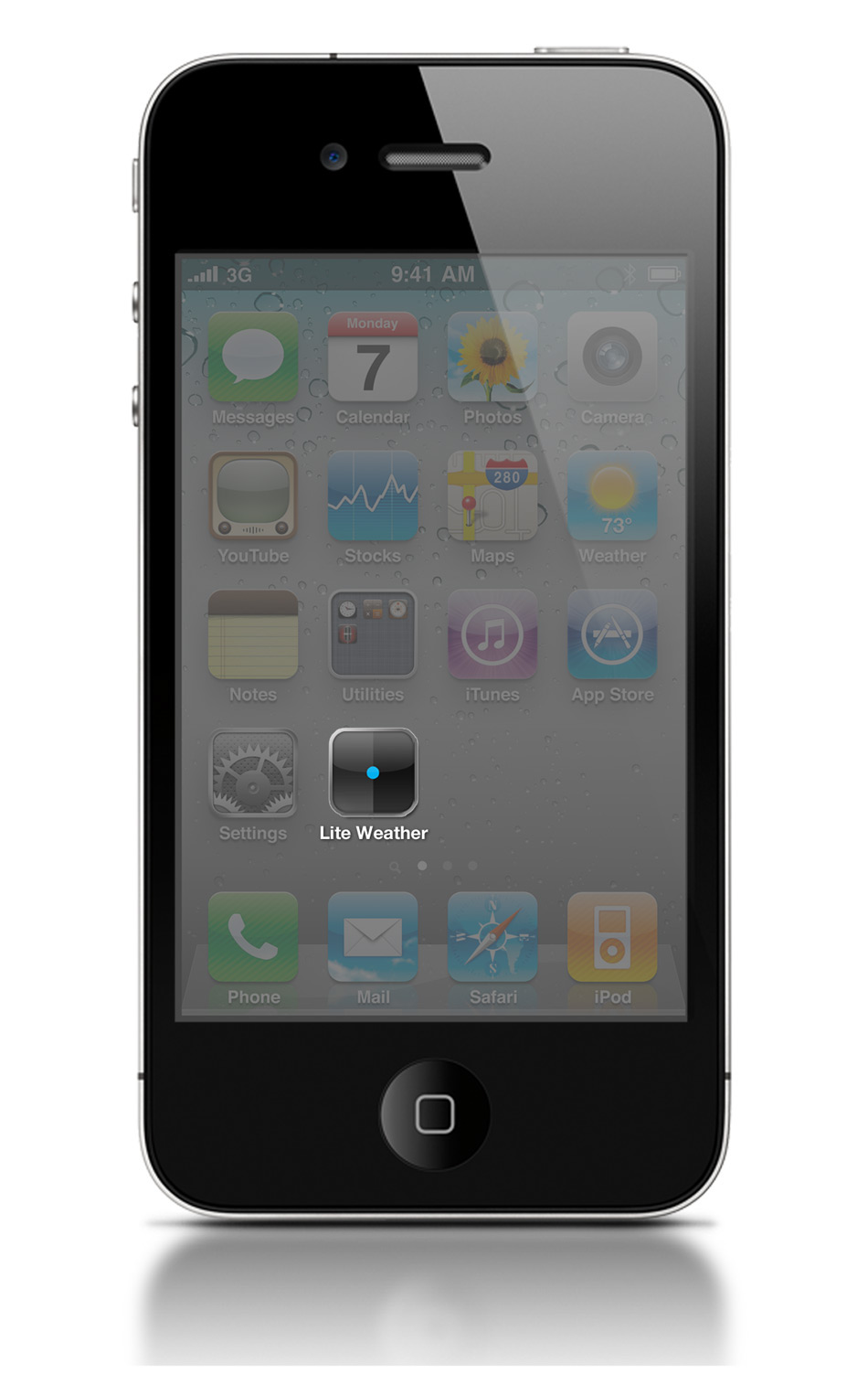
Lite Weather App for iOS

With over 600,000 apps on the iOS App Store, Apple can now fully support the slogan "There's an app for that" back by truth. An area at which many developers and designers have tried and failed to conquer is the weather genre. With a number of hugely functional and accurate weather forecasting apps, as well as a number of less functional, but hugely eye catching designs you may wonder, why design another one.
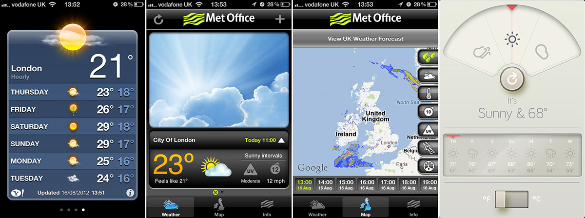
The reason behind Lite Weather is to try and strike a balance between the two types of weather apps available on iOS. The built in weather app is not only inaccurate, but its also relatively annoying to use. The Met Office Weather app is considerably more reliable, offering a huge number of statistics for things like wind speed and direction, tidal info and a generally more accurate standrad of information about conventional weather forecasts, but its an absolute monster. The interface is hideous, and whats more its very hard to navigate. On the flip side, WTHR is a beautifully design and very simple to use; but its strength in my view, is also its downfall. A lack of features and the ability to view or select multiple locations like in the native iOS app means its unlikely to be your go-to app, despite its looks.
With a minimal and simplified interface, some useful (and not quite so useful, but fun features) Lite Weather brings a balance and tries to achieve what the apps before it have failed to do.
From the moment you download the app, you can see that style is a priority. The minimal and in some ways ambiguous nature of the icon, as well as the interface mean that it provides no excess fat. The app is as lite and cohesive as possible, and much of the unexplained aspects of the apps functionality are simply common sense.
By not spelling out the features and directives to the users it makes way for more space on screen. Preventing the cluttered and claostrophobic aesthetics we see all to often on apps of all kinds.
The icon simply takes reference to the selectors within the GUI.
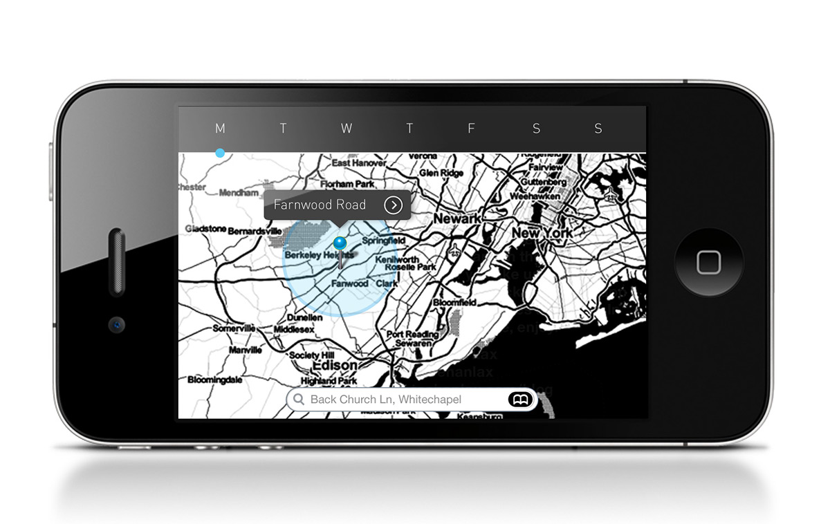
Landing Screen:
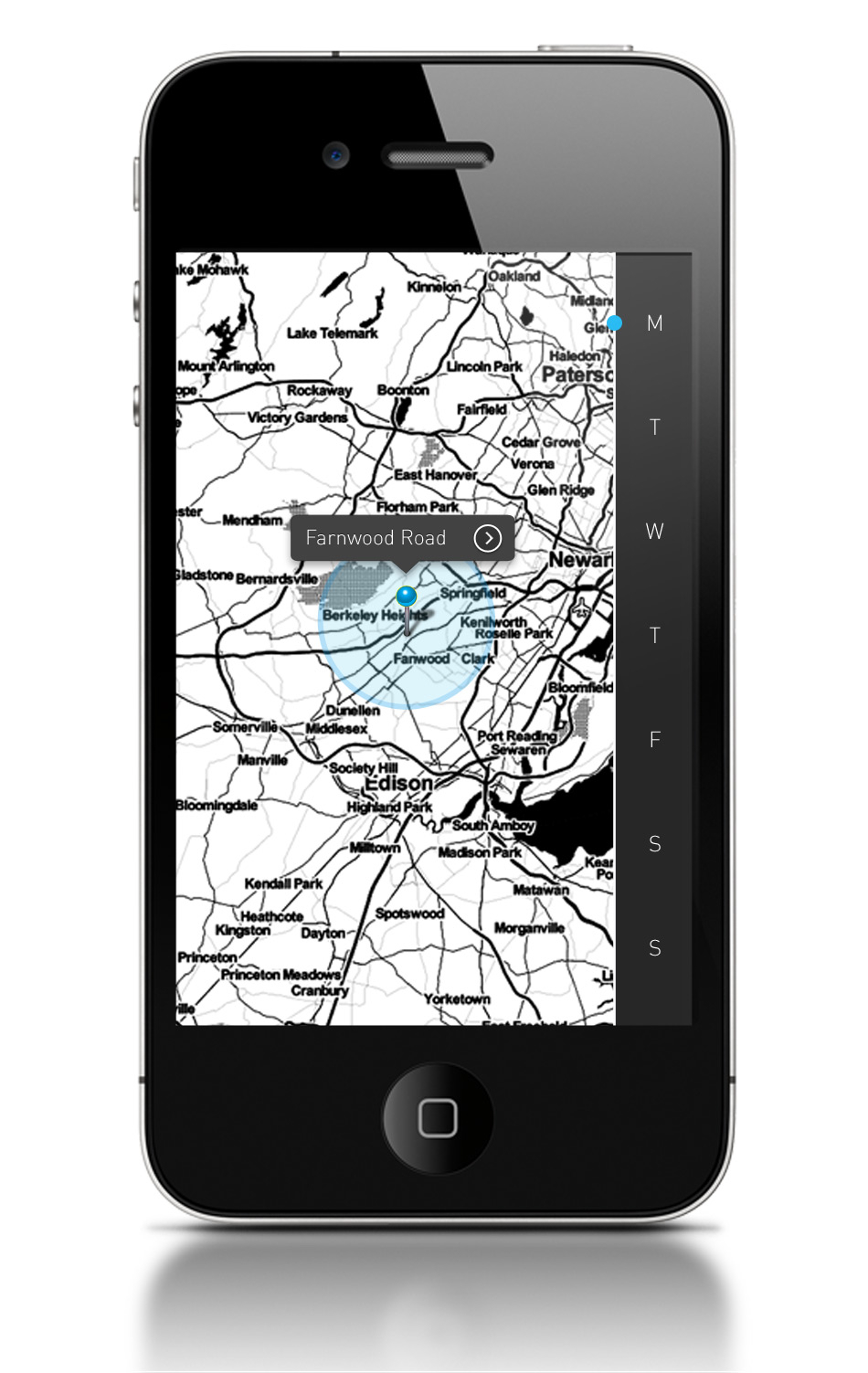
To navigate the map to find the weather in the area you want you have two options:
Option 1: Search the map using a street name, region or postcode.
Once you're selected your region (or before, its totally up to you) you can then select a day using the nav bar on the right hand side, which is a constant throughout the application. This was a big part of the apps design development. All too often apps navigations don't follow the same rules usually placed upon a web design whereby the primary functions of the navigation are accessible from ALL areas.
To navigate the map to find the weather in the area you want you have two options:
Option 1: Search the map using a street name, region or postcode.
Option 2: Scale the map and simply place a pin in the place you wish to know about. (Using the same gestures to navigate as the native Google Maps app)
Once you're selected your region (or before, its totally up to you) you can then select a day using the nav bar on the right hand side, which is a constant throughout the application. This was a big part of the apps design development. All too often apps navigations don't follow the same rules usually placed upon a web design whereby the primary functions of the navigation are accessible from ALL areas.
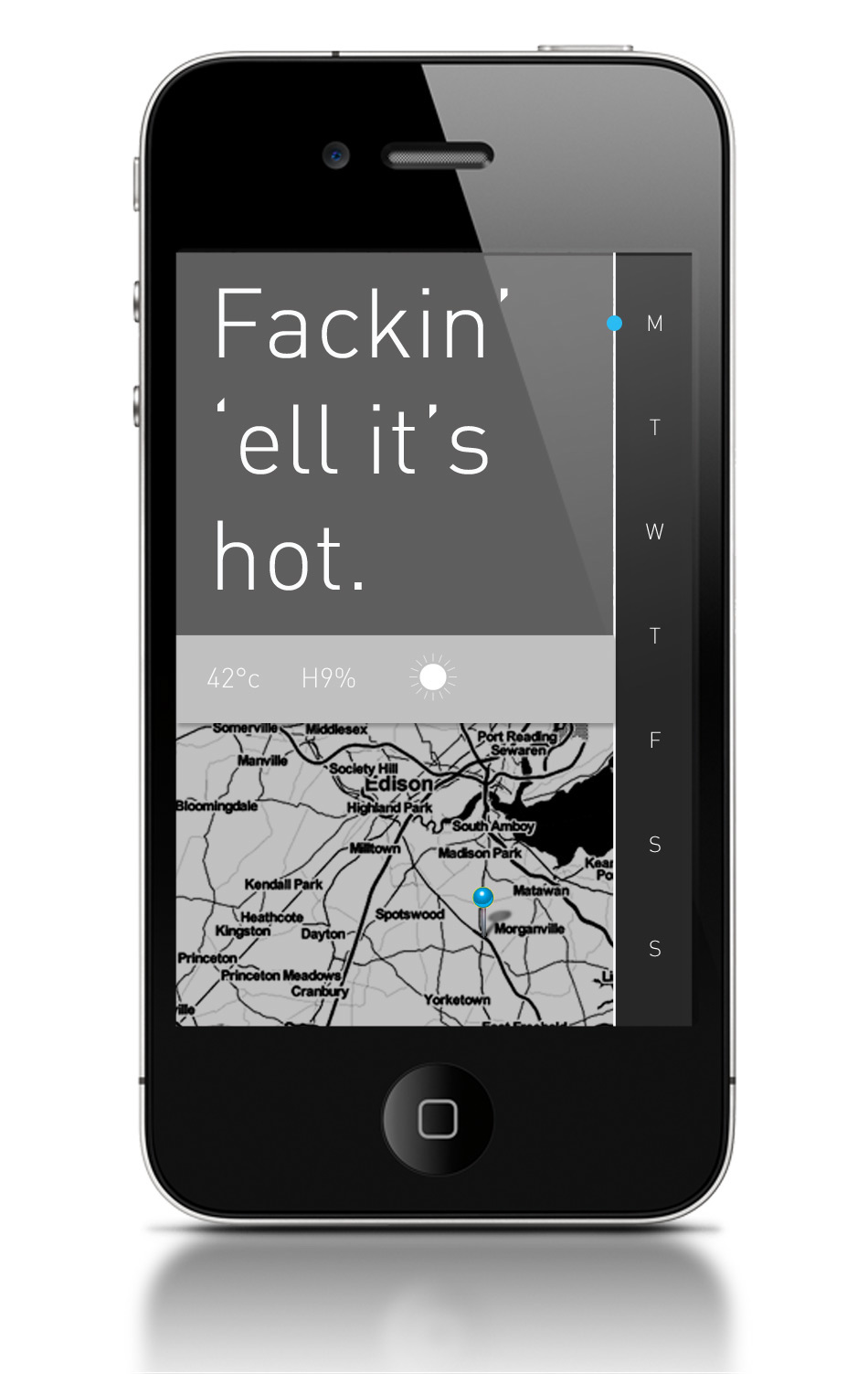
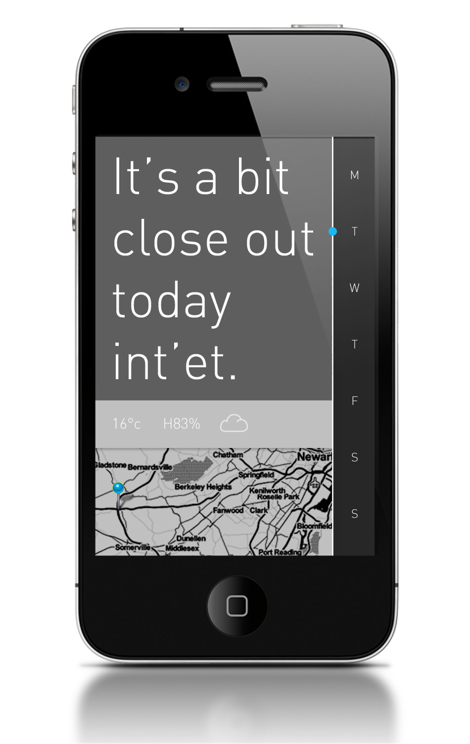
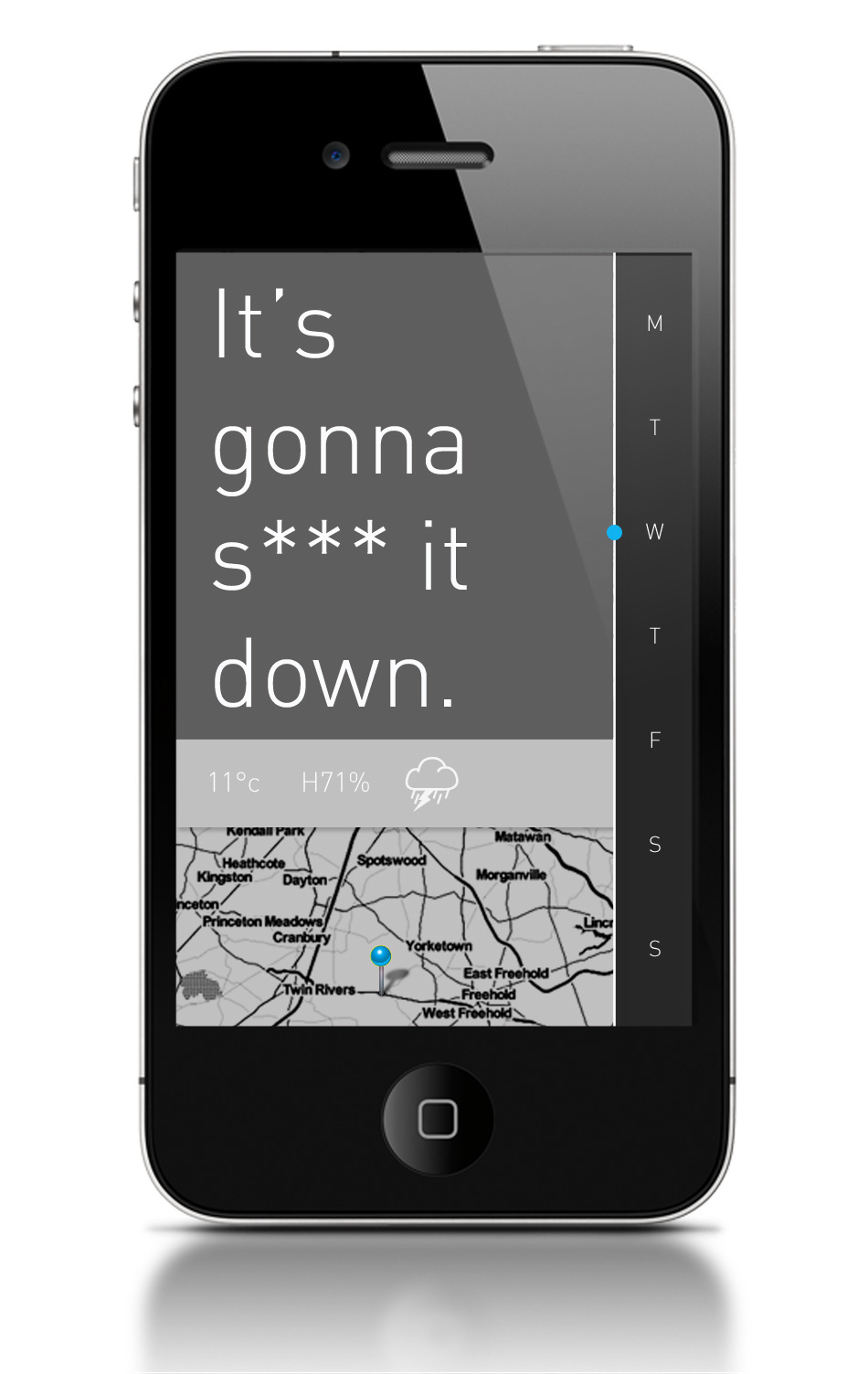
Weather Report:
Copy: The copy shown on screen is a very brief description of the weather, in either present of future tense based on your selection. The tone of voice of the copy references the slang /dialect used in the area in question.
Stats: The bar below the copy features a more detailed outline of the weather on the selected day. Featuring temperature, humidity and the general forecast i.e sunny, overcast, rain.
The combination of these two methods of data (if you can call the first one data) representation are to reduce the dry feel of the app. Although nice to look at, weather is after all, quite a boring thing, and we all need a bit more fun in our lives, especially in England, where the app will invariably present bad news.

Each time you revisit the app, it will automatically change back to the location of your current GPS location, but this is a function that can changed within the setting spanel of the phone, but not directly in the app itself. I felt when designing the UI that features such as setting and home locators and back buttons not features.
The app goes a long was to towards making an attractive, fun and more importantly functional balance between a super high performance app, and one like WTHR.
The intention is for the app to adapt and improve over time with updates with regards to the use of vocabulary relavant to the region on the map but sourcing information from sites such as urban dictionary to help provide an insite into trends and slang terms thats are more "contemporary"


